How to Build a Homepage That Actually Works
(Even If You Hate Writing “Copy”)
If you’re building a website right now, there’s a good chance you’re staring at the homepage, wondering what in the world you’re supposed to say. I’ve been there, and it’s a struggle.
You open a blank page and think,
“I need a headline.”
“I need a tagline.”
“I need this to sound good.”
And then you freeze.
Let me take some pressure off right away.
Your homepage does not need to be clever.
It just needs to be clear.
And it does not need to be built first.
This truth really takes the pressure off.
If you’re brand new, the thing that will move you forward fastest isn’t polishing your homepage. It’s writing posts.
The biggest homepage mistake
The biggest mistake I see women make is starting with the homepage design and spending days and weeks trying to get it perfect.
No one is there yet.
When you launch a brand new website, you are writing into a quiet space. My friend calls it a ghost town. You don’t have traffic. You don’t have readers clicking around. So spending weeks tweaking fonts, rearranging buttons, or trying to craft the perfect headline won't move the needle.
What actually builds direction is content.
When you’ve written 20 or 30 focused posts, something shifts. You begin to see patterns. You understand your pillars more clearly. You start to notice what you’re drawn to and what you’re not.
That’s when a homepage becomes easier to write.
Because now you know what it’s pointing to.
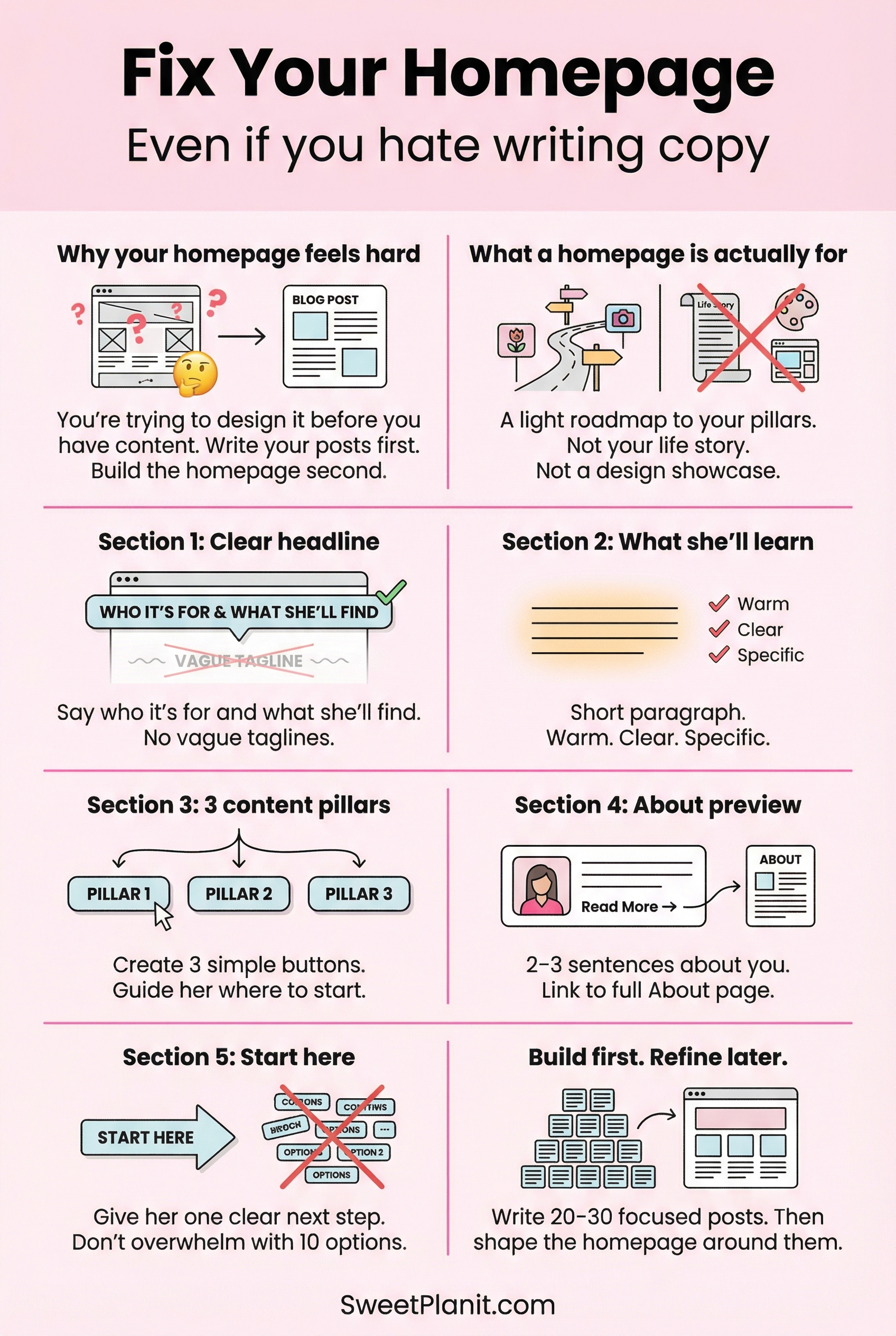
What a homepage is actually for
Here’s a fun fact for you. Most people no longer find you through your homepage.
They land on a single article.
A post they found on Google.
A pin they clicked on Pinterest.
A link someone shared.
They read that one piece of content.
And now every article on your site is essentially a landing page.
If that article helps them, they’ll start clicking around.
Maybe they’ll read another post.
Maybe they’ll look at your categories.
Maybe they’ll click over to your homepage to get the bigger picture.
But the relationship doesn’t start on the homepage anymore.
It starts inside the content.
That’s why the homepage isn’t your starting line.
It’s your orientation point.
They’re scanning for clarity.
A homepage is not your life story.
It’s not a diary.
It’s not a place to impress people with big language.
A homepage is a light roadmap to your pillars.
It tells her:
Who this is for
What she’ll find here
Where to go next
That’s it.
If she lands there and instantly understands who you’re talking to and what you help with, it works.
What makes a homepage feel solid
When I land on a homepage and think, “Oh, this works,” a few things are always true:
I instantly know who it’s for.
The headline is clear, not clever.
There’s a simple path to start.
The page feels calm and bright, not busy.
The navigation makes sense.
There aren’t 15 buttons fighting for attention.
There isn’t a vague tagline like “Helping you live your best life.”
There definitely isn’t a rotating carousel from 2017.
Websites evolve. What looked modern years ago doesn’t always feel current now. Clean and simple wins every time.
If you hate writing copy, do this instead
Most women struggle with homepage copy because they try to write it before they know what they’re building.
They feel awkward talking about themselves.
They don’t want to sound salesy.
They overthink every word.
All of that pressure disappears when you flip the order.
Write your first 20-30 posts first.
Let your content define your voice.
Let your pillars emerge.
Let your direction become obvious.
Then sit down and summarize what you’ve already built.
It’s much easier to say, “This site helps women over 40 build simple online businesses,” when you’ve already written 30 articles that prove that’s what you do.
You’re not inventing anything. You’re describing what exists.
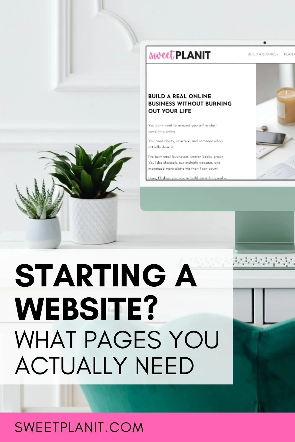
A simple homepage structure you can actually use
If you want something concrete to follow, here’s a clean structure that works beautifully.
1. Headline + short supporting paragraph
Your headline should clearly say who this is for and what it helps with.
Not poetic. Not vague.
Clear.
Underneath that, write a short paragraph explaining what she’ll find here and why it matters.
Keep it conversational. You’re not writing a corporate mission statement. You’re explaining what you do.
2. Your pillars
Choose three content pillars and make them visible.
These can be buttons, sections, or simple blocks.
For example:
Gardening Basics
Seasonal Planting
Natural Pest Control
Your homepage should guide her toward those pillars without overwhelming her.
Too many buttons create confusion.
Three to five clear paths create direction.
3. What she’ll learn here
You can include a short section that answers:
What will she gain by spending time here?
Be specific.
Will she learn how to start?
Grow?
Simplify?
Build confidence?
Write this in warm, straightforward language. No hype.
4. About Me preview
You do not need your entire life story on the homepage.
People know there’s an About page, and if they want to learn more about you, they will go to your About Me page.
A short introduction is enough. Who you are, what you’ve built, and why this site exists.
If she wants more, she’ll click.
5. Start Here
This is especially helpful once you have a content library.
Create a simple “Start Here” section that links to 3–5 foundational posts.
This gives new readers a guided entry point instead of leaving them wandering.
6. Email opt-in (later, not day one)
You don’t need an opt-in on day one.
Get comfortable publishing first.
Once you have content and clarity, add an email opt-in that genuinely helps your ideal reader.
But don’t let the absence of a freebie stop you from writing.
What I’m doing right now
I’m currently pivoting Sweet Planit.
I’ve changed my intro message on the homepage, but I haven’t redesigned the entire page yet.
Why?
Because I’m still building the first 30 posts in my new direction.
I don’t want to promote teaching YouTube when I only have one or two articles about it. I’m building the framework first and hanging the sign out front second.
That keeps everything aligned.
You can do the same.
A homepage that feels confident
When a homepage feels strong, it feels:
Clear.
Intentional.
Consistent.
Calm.
Not perfect.
Your site will evolve, and your Homepage should evolve. Mine always have.
But having a clear and helpful Homepage beats perfection every time.
Your simple action plan
If you’re overwhelmed, here’s what to do:
Write and publish focused content first.
Identify your 3 pillars.
Craft a clear headline that says who this is for.
Add a short paragraph explaining what she’ll find.
Create a simple navigation that points to your pillars.
That’s enough to begin.
You do not need clever copy.
You need clarity.
And once you have content behind you, clarity is much easier to write.
You can do this!